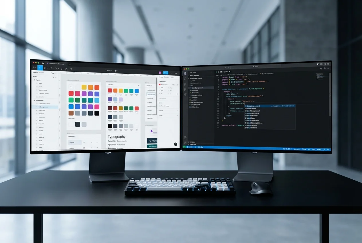

Design Systems
Scaling Your Figma Design System from Seed to Enterprise
·11 min read
There is a fundamental tension in SaaS frontend architecture. At seed stage, you need components built fast — simple, focused, and sufficient for your initial product. At Series B, those same components need to support multiple themes for enterprise white-labelling, handle multi-tenant configurations, and integrate into a versioned design system that your growing engineering team can extend without breaking existing features.
Most Figma-to-code services build for one end of that spectrum. They either deliver quick, flat components that need to be rebuilt when you scale, or they over-engineer an enterprise system that delays your launch by months. Our approach solves this by building components with the right abstractions from day one — simple enough to ship quickly, structured well enough to evolve.
Consider what happens when a SaaS product grows from a single-tenant application to a multi-tenant platform serving enterprise clients who each want their own branding:
Building for these requirements after the fact — retrofitting multi-tenant theming onto a component library that assumed a single theme — is one of the most expensive refactoring exercises in frontend engineering. We have done it for clients who built their MVP without these considerations, and the cost is typically two to three times what it would have been to architect correctly from the start.
Every component references design tokens, never raw values. At seed stage, the token system is simple: a single theme file mapping tokens to values. But the abstraction is in place. When the product grows to need multi-tenant theming, the change is in the token resolution layer — mapping tokens to tenant-specific values — not in the components themselves. Components continue to reference the same token names; the values resolve differently per tenant.
We implement tokens as CSS custom properties, which provides instant theme switching without JavaScript re-renders. A tenant theme change updates the custom property values on the root element, and every component updates immediately. This approach supports any number of themes without performance impact.
We design component APIs with extensibility in mind from day one. This does not mean adding every possible prop upfront — it means structuring the API so that new capabilities can be added without breaking changes. We use several patterns:
White-labelling requires more than swapping colours and logos. Enterprise clients expect their instance to feel like their product, not a themed version of someone else's. Our white-label component architecture supports:
When your component library serves multiple tenants with different themes, visual testing becomes essential. A CSS change that fixes a spacing issue in the default theme might break layout in a tenant's custom theme. We set up automated visual regression testing using Chromatic integrated with Storybook. Every pull request generates visual diffs across all themes and component variants, catching unintended visual changes before they reach production.
Design systems evolve. Your initial typography scale will change. Your colour palette will be refined. Your spacing system will be updated. These changes need to propagate through your component library without breaking existing implementations.
We implement design system versioning through a token migration approach. When the design system is updated, new token values are defined alongside the old ones. Components can be migrated incrementally — one component or one page at a time — rather than requiring a big-bang update. A compatibility layer maps old token names to new values during the transition period. Once all components are migrated, the old tokens are removed.
This approach means your design team can evolve the design system at their own pace, and engineering can migrate at their own pace, without the two needing to synchronise on a single migration date.
Every component we build is documented in Storybook with interactive examples covering every variant, state, and theme. Storybook serves three audiences: designers use it to verify that components match their Figma specifications, engineers use it as API documentation when composing new features, and QA uses it as a visual reference for testing.
For multi-tenant products, we configure Storybook with a theme switcher that shows every component in every tenant theme. This makes it immediately visible when a component does not render correctly in a specific theme — without deploying to a test environment.
If you are building a SaaS product that needs to scale from seed stage to enterprise, book a free consultation. We will review your Figma designs and recommend a component architecture that supports your growth trajectory without premature complexity.


 Custom SaaS Development
 Web App Development
 API Development
 Mobile App Development
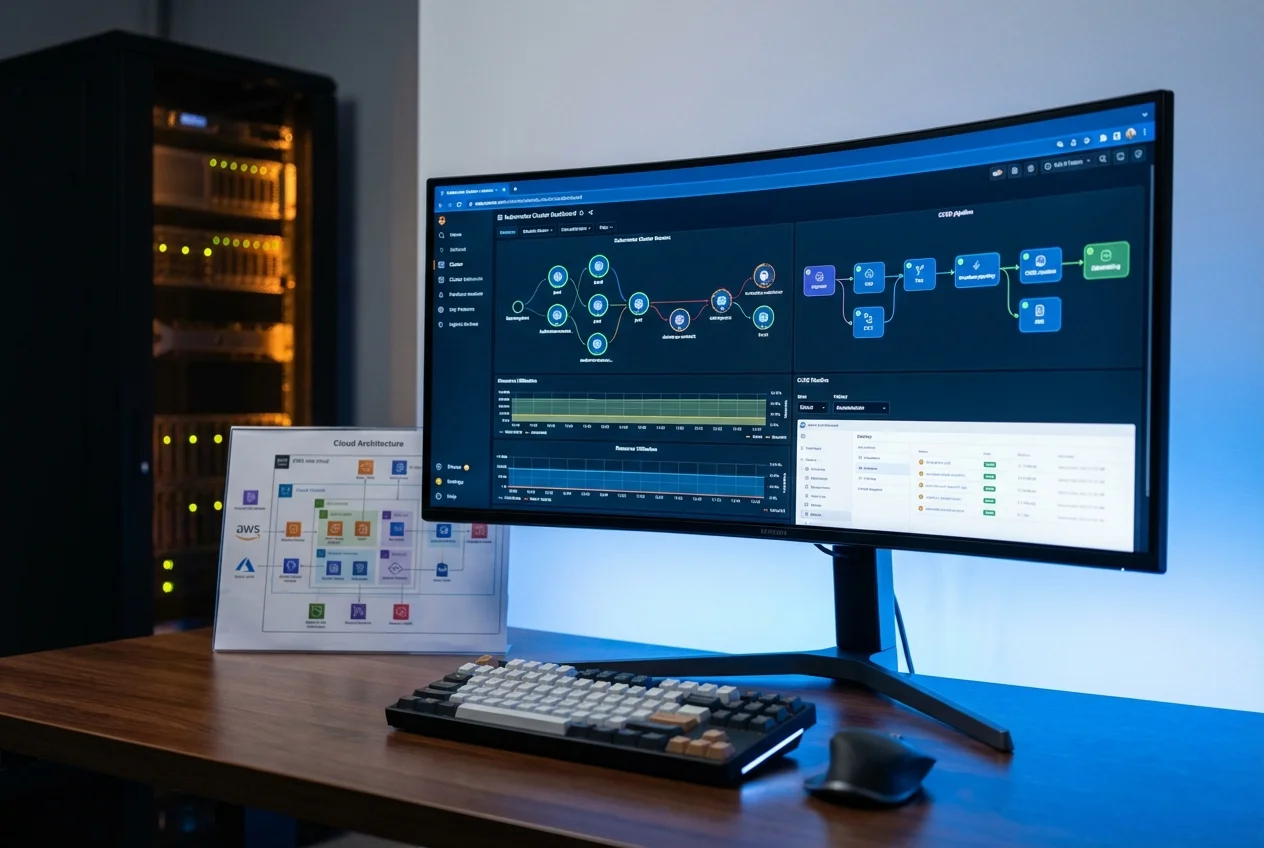 DevOps & Cloud
 Technical Consulting